Modern elevations are unforgiving about colour in a way traditional ones are not.
An ornate facade has mouldings, bands, arches and texture to break up the surface. A contemporary villa is often large flat planes, deep shadows and glass. There is nowhere for a bad colour decision to hide.
What Modern Elevations Ask From Colour
Three things, and they run counter to how most people choose paint.
Restraint in the number of colours. Two shades is typical, three at most. Contemporary architecture creates interest through form, shadow and material, so the colour’s job is to support that rather than compete with it.
Tonal relationships rather than contrast. Shades from within a single family, differentiated by depth rather than hue. This is why so many successful modern elevations look almost monochrome in photographs.
Matt over sheen. Flat finishes absorb light and let the form read cleanly. Sheen finishes create reflections that fight the geometry.
Approach 1: Monochrome Layering
One colour family, three depths.
Base in the lightest tone across the main field, roughly 60 percent of the facade. A mid tone from the same family on projecting or recessed volumes, around 30 percent. The deepest tone on entrance recesses, soffits and shadow gaps, around 10 percent.
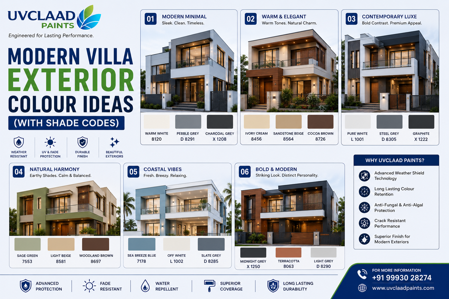
Sample scheme in greys: light grey base, stone grey on the projecting first-floor volume, charcoal in the entrance recess and under balcony soffits.
Sample scheme in warm neutrals: warm white base, sand beige on secondary volumes, deep taupe in recesses.
This approach is nearly impossible to get wrong, which is precisely why it is so common in contemporary work.
Approach 2: Warm Minimal
A reaction against the cool grey period, and currently the stronger direction.
Warm white or ivory base across the majority of the facade. Timber or timber-look cladding on one or two elements, typically the entrance and a first-floor balcony. Warm greige or taupe on secondary volumes. Metalwork in black or bronze.
The point is that colour does very little here. The timber and the shadow do the work, and the paint provides a quiet field for them to sit against.
Sample scheme: warm white base, taupe on the recessed entrance volume, natural timber slat screen, bronze railings.
Approach 3: Contrast Banding
Higher risk, higher reward, and dependent on the elevation actually having horizontal or vertical divisions to work with.
A light base with a distinctly darker band expressing a structural line, a floor level, a projecting slab edge, or a vertical circulation core.
The rule that makes this work: the band must follow something real in the building. A dark band drawn across a wall for decoration reads as arbitrary. The same band expressing the floor slab reads as intentional.
Sample scheme: off white base, charcoal band at first-floor slab level continuing around the building, black window frames.
Approach 4: Material-Led Neutral
For elevations with significant stone, exposed concrete, brick or jaali work.
Here paint is genuinely secondary. Choose a neutral that sits quietly beside the material, usually a shade slightly lighter than the material itself and matched to its undertone.
Kota stone and sandstone are warm, so pair with warm white or sand. Granite and exposed concrete are cool, so pair with cool light grey or off white. Terracotta jaali needs a warm neutral with enough contrast that the jaali reads as a distinct element.
The failure mode is choosing a paint colour that competes with the material. Both then look diminished.
Matt vs Sheen on Modern Facades
Matt, in almost every case.
Sheen finishes reflect sky and surroundings, which on a large flat plane produces uneven brightness across the surface and undermines the crispness that modern elevations depend on. They also make any surface undulation dramatically more visible in raking light.
Matt absorbs, keeps the plane reading as a single flat surface, and hides minor imperfections in the plaster.
The practical counterpoint is that matt finishes hold slightly more dirt and are harder to clean. On a feature elevation at eye level, a low-sheen finish is a reasonable compromise. On upper floors, matt throughout.
How Colour Interacts With Louvres and Shadow
Contemporary elevations often use louvres, fins, slat screens and deep reveals. These create strong shadow patterns that change through the day, and colour behaves differently against them.
A light colour behind louvres maximises the shadow pattern, since the contrast between lit and shaded surface is greatest. A dark colour behind louvres flattens the pattern, because the shadow and the surface are already close in value.
So if the screen is the feature, keep the wall behind it light. If the screen is meant to be subtle, a darker recessed wall will mute it.
Same logic applies to deep window reveals. A light reveal reads as depth. A dark reveal reads as a void, which is sometimes exactly what is wanted.
Ten Ready Schemes
- Warm white base, taupe secondary, charcoal recesses, black metalwork
- Light grey base, stone grey volumes, charcoal entrance, timber door
- Off white base, charcoal slab band, black window frames
- Ivory base, sand beige secondary, timber slat screen, bronze railings
- Stone grey base, off white recesses, natural stone plinth
- Pure white base, black frames, charcoal entrance volume
- Warm white base, terracotta jaali, deep brown soffits
- Pale sand base, taupe volumes, olive green entrance door
- Light grey base, exposed concrete elements, black metal
- Warm greige base, deep charcoal circulation core, timber accents
Frequently Asked Questions
What colours suit a modern villa?
Two or three shades from a single tonal family in matt finish, typically light neutrals with a deeper accent. Warm whites, greiges, light greys and taupes dominate contemporary Indian elevations, with colour kept deliberately quiet so form and material lead.
How many colours should a modern elevation have?
Two is typical and three is the practical maximum. Contemporary architecture creates interest through volume, shadow and material, so additional colours tend to compete with the form rather than support it.
Is matt or gloss better for modern exteriors?
Matt, in nearly all cases. Sheen finishes reflect sky and surroundings unevenly across large flat planes and make surface undulations more visible in raking light. Matt keeps each plane reading as a single clean surface.
Which exterior colour looks most premium?
Muted, slightly complex neutrals in matt finish generally read as most considered, particularly warm greys, taupes and off whites. Restraint in the number of colours contributes more to a premium appearance than any specific shade.
What are the 2026 villa exterior trends?
Warm neutrals have largely displaced the cool greys of the previous decade, paired with timber or timber-look cladding and black or bronze metalwork. Monochrome tonal layering and matt finishes remain the dominant contemporary approach.