Choosing an exterior colour is oddly high pressure. It is expensive, it is public, you look at it every day, and you cannot repaint next month if you dislike it.
Which is why most people default to cream. Here is a more useful approach, plus 25 combinations that work on Indian elevations.
How to Pair Exterior Colours Without Guessing
Three principles do most of the work.
Stay within one temperature. Warm colours with warm, cool with cool. A warm cream with a cool grey looks subtly wrong in a way most people cannot name but can see. Mixing temperatures is possible but requires deliberate handling.
Vary the value, not just the hue. Two colours at similar lightness sit flat against each other. You want a clear difference in how light or dark they are, which is what creates definition on an elevation.
Let the fixed elements decide. Your roof tiles, stone cladding, window frames and main door are already chosen. The paint has to work with them, not against them. Start from what you cannot change.
The 60-30-10 Rule Applied to Elevations
Borrowed from interiors, and it translates well.
Roughly 60 percent of the visible facade in your base colour. Around 30 percent in a secondary shade, typically on projecting blocks, recessed bays or the upper level. And about 10 percent as an accent on the entrance, a feature column, a band, or the balcony soffit.
Most elevations that look busy have broken this, usually by making the accent 30 percent instead of 10.
Neutral Combinations (Safest, Most Timeless)
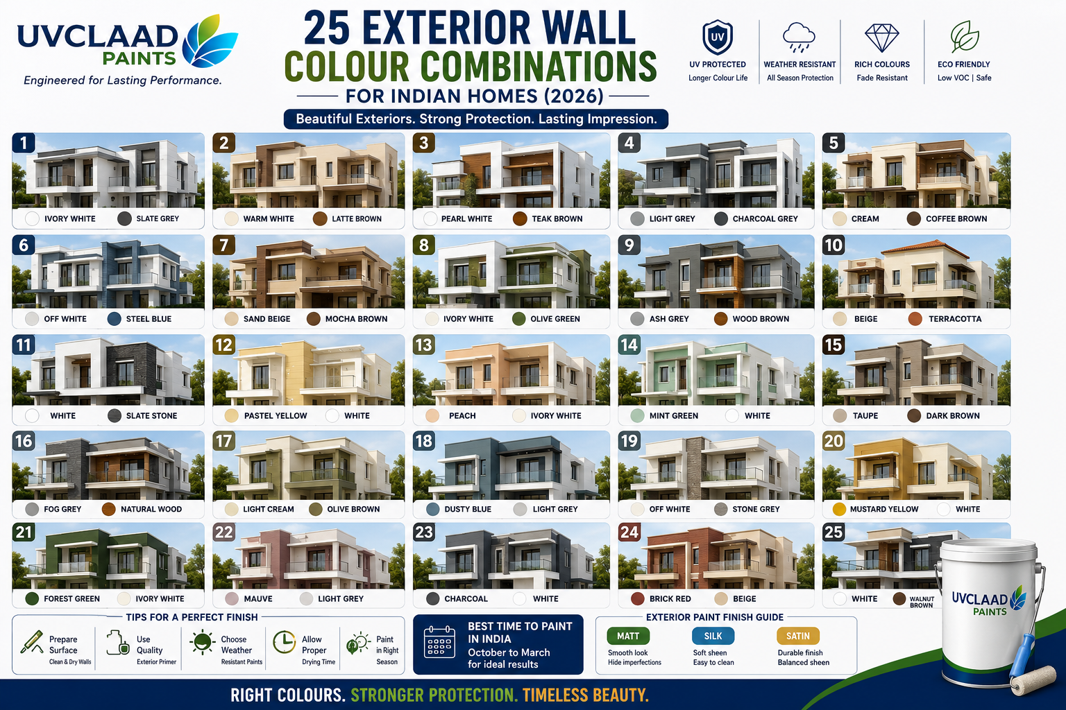
- Warm white base with charcoal grey accents
- Off white beige base with coffee brown bands
- Ivory cream base with stone grey secondary
- Light grey base with pure white trim
- Pure white base with dark grey window surrounds
- Sand beige base with warm white bands
- Stone grey base with off white recesses
These are the combinations that still look considered in fifteen years. They are also the easiest to sell a house with.
Warm Earthy Combinations
- Sand beige base with terracotta accent
- Ivory cream with burnt sienna feature wall
- Warm white with olive green shutters and grilles
- Light taupe with deep brown fascia
- Cream base with mustard ochre entrance bay
- Warm beige with rust red accent band
These suit traditional and semi-traditional elevations, courtyard houses, and anything with stone or exposed brick already present. They also handle dust better than cooler palettes, which is worth something in most of North India.
Cool Grey and Blue Combinations
- Light grey base with charcoal accents and white trim
- Stone grey with slate blue feature elevation
- Off white with steel blue window surrounds
- Pale grey with deep navy entrance
- Cool white with graphite grey banding
- Silver grey with teal accent on balcony soffits
Best suited to contemporary elevations with clean lines, large glazing and metal railings. Less successful on ornate or traditional facades, where they can read as cold.
Bold Accent Combinations
- Warm white base with a single deep indigo feature wall
- Light beige with a terracotta double-height entrance bay
- Off white with forest green shutters and gate
- Pale grey with a mustard yellow entrance recess
- Cream with a deep maroon plinth band
- Stone grey with a copper-toned accent column
The rule with these: one accent, one location, no more than about 10 percent of the visible facade. Two bold accents on the same elevation almost always compete.
Combinations That Age Badly
Worth naming, because these appear on a lot of elevations built between 2010 and 2020.
- Bright orange or magenta accents. Organic pigments, and they fade unevenly within three or four years, which looks considerably worse than the original.
- Three or more strong colours on one facade. Reads as busy immediately and dated within five years.
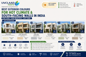
- Very dark full elevations in hot regions. Heat gain is real, and fade shows up dramatically on large uniform dark areas.
- Cool grey with warm cream. The temperature clash is subtle and permanent.
- Matching the paint exactly to the roof tile. Removes all definition. Contrast is what makes an elevation read.
Matching Colour to Your Elevation Style
Contemporary minimal: two shades from one tonal family, matt finish, accent under 10 percent.
Traditional or courtyard: warm earthy base with a deeper warm accent, and let the timber and stone lead.
Duplex and row house: a base shared with neighbours if there is a scheme, differentiated by trim and entrance colour rather than the field.
Farmhouse or low-rise villa: lighter base, larger accent area permitted, and stronger tolerance for earthy colours because of the surrounding landscape.
How to Test Before Committing
Buy 1-litre cans of your two or three shortlisted shades. Paint patches at least 600 mm square directly on the wall, not on paper or a board.
Put a patch on the south wall and another on the north wall of the same building. The same colour reads noticeably different on each.
Then look at them at three times: mid-morning, mid-afternoon, and around sunset. Exterior colours shift more under changing light than interior colours, and a shade that looks perfect at 11 am can look completely different at 5 pm.
Leave the patches up for at least a week before deciding. It costs a few hundred rupees and it is the only reliable way to avoid an expensive regret.
Frequently Asked Questions
Which colour combination is best for house exterior?
A light neutral base with a darker accent is the most reliable pairing, using roughly 60 percent base, 30 percent secondary and 10 percent accent. Warm white with charcoal grey, beige with coffee brown, and off white with terracotta are the most durable choices.
What are the 2026 exterior colour trends?
Warm neutrals and earthy tones have replaced the cool grey dominance of recent years, with muted greens, terracotta and taupe gaining ground. Matt finishes and tonal layering within a single colour family are increasingly common on contemporary elevations.
How many colours should a house exterior have?
Two or three is the practical limit. A base colour, a secondary shade for projecting or recessed elements, and optionally one accent kept to around 10 percent of the visible facade. More than three usually reads as busy.
Which exterior colours look expensive?
Muted, slightly complex neutrals in matt finish, such as warm greys, taupes, stone and off whites, generally read as more considered than bright saturated colours. Restraint in the number of colours matters more than the specific shades.
Do dark exterior colours get hotter?
Yes, significantly. Dark shades reflect under 20 percent of incident light compared with 60 to 85 percent for light colours, and surface temperatures can differ by 15 to 20 degrees Celsius. Use dark shades as accents rather than full elevations in hot regions.